Why Touch Design Matters More Than Ever
Mobile traffic now accounts for over 60% of web usage globally. But here’s what most designers miss: responsive design and touch-friendly design aren’t the same thing. You can shrink a desktop layout to 375 pixels and still create a frustrating experience. Touch interaction is fundamentally different from mouse interaction.
The human finger is roughly 45-57 pixels wide at the tip. That’s your real constraint. When someone taps your interface, they’re not aiming at a 16-pixel button — they’re pressing an area about the size of their fingertip. Design for that reality, and everything changes.
The Core Problem: Designs built for mouse cursors create friction on touch devices. Tiny buttons, close spacing, and hover states that don’t exist on mobile all contribute to frustrated users and abandoned carts.
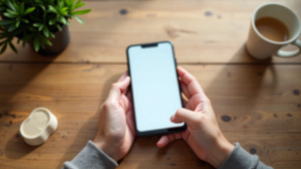
The Minimum Touch Target Size
Apple’s Human Interface Guidelines recommend 4444 points (roughly 4444 pixels on standard displays) as the minimum touch target. Google’s Material Design suggests the same: 4848 dp minimum. These aren’t arbitrary numbers — they’re based on actual human biomechanics.
Your thumb naturally extends about 1-1.5 inches. When you’re holding a phone in one hand, you can’t reach the entire screen comfortably. The reachable zone forms a rough circle in the lower half of the display. Design your most critical interactions — primary buttons, main navigation, frequently used actions — within that zone.
Space buttons with at least 8-12 pixels of padding between them. This prevents the dreaded “accidental tap on the wrong button” problem. We’ve all tapped “Delete” when we meant “Cancel.” That’s not user error — that’s bad spacing.
- Primary buttons: 4848 px minimum
- Secondary buttons: 4444 px
- Icon buttons: 4040 px minimum
- Form inputs: 44px height

Spacing and Padding Strategies

Spacing isn’t just about aesthetics — it’s about preventing mistakes. When users tap quickly (and they always do), small gaps between buttons create ambiguity about which one they actually hit.
Use consistent vertical rhythm. If your buttons are 48 pixels tall, space them 12-16 pixels apart. This creates a predictable grid that feels right to users. Form inputs benefit from even more space — 16-20 pixels between fields prevents accidental selection.
The “fat finger” problem is real. In one study, users made selection errors 5-8% of the time with 22-pixel spacing. That dropped to less than 1% with 44-pixel spacing. The difference between a workable interface and a frustrating one is often just padding.
Pro tip: Use CSS padding instead of margins for touch targets. Padding extends the clickable area, while margins create dead space.
Navigation Patterns That Work on Mobile
Desktop navigation with horizontal menus and dropdowns falls apart on touch screens. There’s no hover state, so “hover to reveal submenu” becomes invisible. Your users can’t see what options exist until they tap.
Bottom navigation works better. It’s within thumb reach, visible at all times, and you can fit 3-5 main sections comfortably. If you need more navigation, use a hamburger menu — but make it at least 4444 pixels. Don’t hide critical functionality.
Tabs are fine for 2-4 items. Beyond that, they become cramped. Swipe navigation feels native to mobile users but requires clear visual indicators showing which content is active and that more content exists to the side.
Feedback and Visual States
Touch feedback is immediate and physical. When users press a button, they expect instant visual response. A 100-200 millisecond color change or slight scale transform signals that the tap registered. Without it, users tap again — and again.
Don’t rely on hover states. Touch devices have no hover. If critical information only appears on hover, mobile users never see it. Move that information into the visible interface or use a tap-to-reveal pattern.
Focus states matter too. When a user taps an input field, make it obvious. A 2-3 pixel border color change, a background color shift, or a slight shadow increase all work. Mobile users are moving fast — clear focus states prevent them from typing into the wrong field.

About This Guide
This article provides educational information about touch-friendly design principles and best practices. Design guidelines and accessibility standards evolve. Always test your interfaces with real users on actual devices to ensure they work well. Different devices, screen sizes, and user preferences require ongoing refinement of your designs.
Start Building for Touch Today
Touch-friendly design doesn’t require complex techniques. It’s about respecting the physical constraints of human fingers and the context of mobile use. Larger buttons, generous spacing, clear feedback, and touch-native navigation patterns — these fundamentals solve most mobile usability problems.
Test on real devices with real users. Watch where their fingers go. Listen to their frustrations. That’s where you’ll find the gaps between what you designed and what actually works. Start with the 48-pixel button rule and proper spacing, then iterate from there. Your mobile users will thank you.